Burberry Logo and symbol, meaning, history, sign.
Mục lục
Burberry Logo
Burberry (Burberry Group Plc) is a British designer and manufacturer of luxury clothing, accessories, and perfumes. Most people associate Burberry with iconic trench coats and scarves. Burberry’s trademark is the check pattern, which uses red, black, white, and sand colors. Almost every major figure in the fashion world, including Hollywood celebrities, has occasionally worn Burberry. In fact, back in 1919, the brand received a royal patent from George V and became the official brand of the British Royal Family.
Meaning and History

In 1865, Thomas Burberry founded his own clothing company called T. Burberry and Sons, located on Winchester Street in Basingstoke. Fifteen years later, he invented gabardine, a waterproof and breathable fabric. Initially, they were intended for officers of the British Army, then for travelers and pilots. In 1888, Thomas Burberry received a patent for the production technology of a new fabric. The company continued to develop. In 1909, it opened the first mono-brand boutique in the capital of France. After the end of the First World War, the history of the brand received a new development as Burberry clothes began to be worn by ordinary people and celebrities. In 1999, it was renamed Burberry instead of Burberry’s. To date, the brand is represented in 50 countries around the world and has more than 5,000 boutiques.
What is Burberry?
Burberry is one of the most recognizable British brands. The legendary brand is the true embodiment of British elegance and sophistication. Today, several lines of men’s and women’s clothing, a collection for children, underwear, accessories, and perfumes are produced under the Burberry brand.
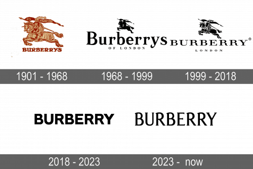
1901 – 1968

At the beginning of the new century, the brand began to officially supply outerwear for the British army. Thus, it had to create branded markings on the uniforms of officers. The founder went for a knight on horseback in armor with a spear and a flying flag with the inscription “Prorsum”, which translates as “forward’ in Latin “. The spear in the knight’s hand is also not a coincidence. It became a symbol of protection and preservation of the best traditions of the brand. At the bottom of a detailed knight drawing, there was the name of the brand. It was printed using a bold, serif typeface and all uppercase letters to match the courageous spirit of the knight.
1968 – 1999

The name of the company became the main part of the logo, while the knight image was just a relatively small, black silhouette above it. The brand name was done in bold font with the first letter capitalized. The font also featured bracketed serifs. Under the brand name, it stated “Of London” using the same font but all uppercase letters, which were significantly smaller in size. The brand image looked updated while preserving the key element of the brand.
1999 – 2018

The designer Fabien Baron not only changed the font but also brought back more details in the horse and the knight while keeping the color palette black and white. He used Bodoni Family font with hairline serif and all capital letters. The “of” preposition was removed, leaving only “London” on the second line. The logo looked sleek and was a representation of a luxurious fashion brand.
2018 – 2023

The company followed the trend of more minimalistic, clean brand logos and removed the knight image it has been using for over a century. The new logo was created by Peter Saville. It had only the name of the brand although there was also a version with a “London England” tagline underneath. Although the logo was simple, the brand name spoke for itself. It reflected the confidence of a reputable brand.
2023 – Today

The knight returned thanks to the requests of the brand fans. The company realized that it was part of the brand image for too long to be taken away so easily. Such a move proved that the company still has the same values as it did one hundred years ago and it cares about the opinion of its consumers. This is further strengthened by the blue color used in the logo, which symbolizes loyalty and trustworthiness. The details in the image became even more exquisite. The font for the brand name underneath was also new and looked like a refined, stylish version of the original one.
Font and Color

Originally, the logo was done in burgundy and golden colors, which looked very luxurious. Since 1968, the brand used only black for its logo with a white background. The company has always used bold typefaces with serifs. In 1999, for instance, it introduced a logo that used a Bodoni Family font. The logo created in 2023 had a serif font that was a mixture of Moonllys Regular and Valeson Condensed Regular. The exception was a period from 2018 to 2023 when the designers used a simplified sans-serif typeface.


