Burberry’s new logo: in aspiring for simplicity it has ended up with basic
Amazing to think, but it’s five years since Angela Ahrendts left Burberry for Apple. And only this year Christopher Bailey moved on. The team that repositioned and reinvigorated this venerable 162-year-old British brand with commercial success (sales rising to over £2bn) and credibility (shares soaring threefold to £7bn) are now completely gone.
They achieved what they did – turning Burberry into the luxury industry’s digital leader, overseeing a reinvigoration of the company’s style and masterminding the store to a bricks-and-mortar incarnation of the brand’s website – by focussing on product and experience. They didn’t touch the identity.
All eyes then on today’s new duo, Marco Gobbetti, with Burberry since 2016, as CEO, and Riccardo Tisci, ex-Givenchy and the recently installed chief creative officer of Burberry.
Making his first move in his new role and ahead of his first runway show this September, Tisci has unveiled a new identity for the British heritage brand.

It’s a bold move to change the logo for a brand that hasn’t touched its identity in 20 years. The last logo revamp was in 1999 when the brand dropped the ‘’s’ from Burberry’s. And this time the change is considerably bigger.
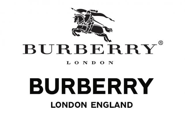
If you know Burberry, you can probably visualise the equestrian knight sat above the Burberry name in recognisable wide-spaced lettering. First introduced in 1901 and containing the Latin word Prorsum, meaning forwards, the knight was a reference to the breathable and waterproof outdoor attire for which the brand became famed.
In Tisci’s new Burberry logo, the knight that denoted ‘Forwards’ hasn’t just gone forwards, he’s completely ridden off the identity. Gone too is the familiar typeface, replaced with a bold sans serif. Underneath the name, it says London England.
There’s also a new interlocking ‘TB’ pattern inspired by a 1908 monogram for Thomas Burberry that Tisci discovered in the Burberry archives. Presumably this will pop up here and there. It’ll be interesting how this pattern relates to the check.
No doubt this new identity – and particularly the new logo – is a strategy to shed the trench-coat image to be seen as a thoroughly modern designer.
What’s clear is that this new identity is following the trend of unadorned, undecorated, unembellished style that arguably met its apotheosis when Hedi Slimane made the similarly bold decision to change the famous YSL logo designed by Cassandre to the Helvetica all-cap Saint Laurent of today. Something other heritage brands have copied, in the hope of reviving relevance.
However, with Saint Laurent, the new identity did in fact borrow from the original ready to wear logo from the 1960’s, so it was a smart move, based on something that connected the new identity back to Yves.
Contrast and compare the Burberry situation with Hermès, a brand of similar vintage and recognition that has hardly put a foot wrong in its 181 years. Can you imagine Hermès ditching the horse-drawn carriage from its logo? Hermès hasn’t copied others stylistically to remain an exceptionally strong brand of incredible stature. In fact, with its horse-drawn carriage and serif-faced name it still ranked thirteenth on Forbes’ list of the world’s most innovative companies.
Or then there are the recent brands like Supreme or Off-White that have used an unapologetic straight-forwardness to their brand identities with considerable elegance and success. They are of their time and manage themselves with considerable skill. The identity is unfussy because the brand focusses on experiences and collaborations. In their case the unadorned, undecorated and unembellished nature of their identities allows room for expression and partnership. Simple, stylish, smart.
But with the new Burberry logo, in the pursuit of simplicity the design team have instead ended up with basic.
And having gone to such lengths to seemingly simplify, there’s the superfluous ‘England’ after London. What, as opposed to London, Kiribati?
Provenance matters. And confidence is necessary. You’ll notice that Saint Laurent and Hermes both have Paris after their name. Confident that most consumers will know they mean Paris, France, and not Paris, Texas.
With this new identity, it feels as if Burberry is trying to be what it thinks it should be, rather than what it is. A new order of the wrong kind.
Great brands keep things simple, confidently sticking to three principles:
1. Be authentic.
2. Connect with your consumers.
3. Never follow others.
That’s how you go forwards.
Philip Davies is the EMEA President of Siegel+Gale


