Can the return of Burberry’s knight rescue fashion from a fate worse than death?
Emma Barratt, global executive creative director at branding consultancy Wolff Olins, details the impact of Burberry’s logo change and why it might spur other luxury brands to follow suit.
Under Daniel Lee, its new chief creative officer, Burberry has looked to its past for its new brand identity and, paradoxically, emerged more future-facing.
Burberry’s new serif logo, along with the brand’s equestrian knight symbol, marks a long overdue pivot in modern luxury branding. A world that has been dominated by a consciously blank minimalist aesthetic in recent years.
Advertisement
Under its previous creative figurehead, Ricardo Tisci, the brand adopted a Peter Savile-designed wordmark and a very modern interpretation of a heritage TB monogram. The reasoning behind this shift was that modern minimalism makes the brand more accessible and appealing to a younger generation of digital natives and the Chinese market in particular.
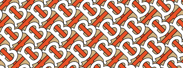
It didn’t hurt that the identity was well suited to a social-media-first, digitally driven experience. Under Tisci, Burberry experimented freely with AR and virtual communities. The simpler the typography and the fewer embellishments the better.
At the same time, many fashion houses, including Saint Laurent, Celine, Balmain and Berluti, ditched their characterful, heritage-focused marks for the clean, minimalist typefaces favored by tech brands like Google and Microsoft.
This aesthetic became so ubiquitous among fashion brands that a backlash was inevitable, and soon memes sprung up bemoaning the fact that fashion logos were becoming almost indistinguishable from each other.
Advertisement
A utilitarian, uncluttered identity is incredibly functional in making sure your brand is legible but did this identity lose the primary point of an identity? Did it truly represent the character and spirit of Burberry?
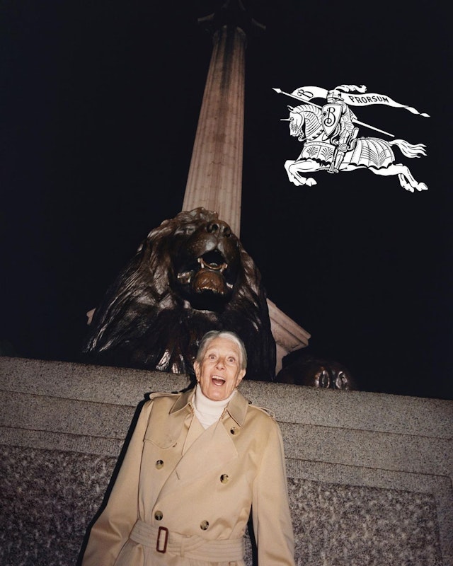
By reinstating the EKD ‘Equestrian Knight Design’ – the winning entry of a public competition to design a new logo for the brand in 1901 – Burberry is signaling a confident move on from the now-dominant luxury streetwear aesthetic and back toward what made the brand unique in the first place. Britishness. Trench coats. The check. A connection to British creative culture in all its modern contradictions, high and low, traditional and emerging.
The new wordmark echoes Lee’s previous experience at Bottega Veneta and Maison Margiela – brands with more distinct personalities in their visual expression. But the move by Burberry shouldn’t be seen as a reaction to minimalism overkill; it shows that the brand is moving to keep up with culture, and reclaiming ownership of the assets that people know it for.
It’s too soon to judge the success of this new chapter, but the new Burberry identity is accompanied by a campaign that is unabashed in its celebration of Britishness, fronted by a host of British stars, from actress Vanessa Redgrave to footballer Raheem Sterling, and replete with British landmarks and, of course, Burberry’s signature check and trench coats at its center.
In his choice of aesthetic no one can be in any doubt that Lee, who was born in Bradford, is returning Burberry’s focus to its Britishness. The signs are there that this could be a continuation of Burberry in the era of Christopher Bailey, a fellow Yorkshire man.
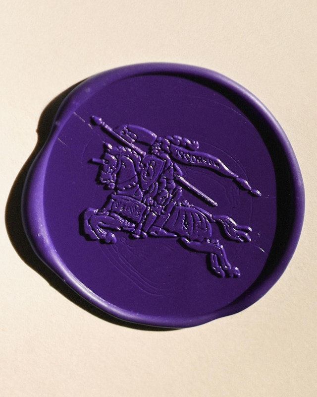
Like the Latin word ‘prorsum’ meaning ‘forwards’, found in the flag their knight is proudly carrying, Burberry continues to only look forward.
Advertisement
But arguably the real mission of Burberry’s equestrian knight is to rescue the brand from a fate even worse than death: being boring.
Some of the most interesting brands like Bottega Veneta, Loewe and Zegna, never stopped following their own paths in the first place. Expect many of their competitors to follow Burberry’s lead. A trendsetter once more.
