The Secret Behind Chanel’s Unique Packaging
‘In order to be irreplaceable, one must always be different’ – Gabrielle Bonheur “Coco” Chanel
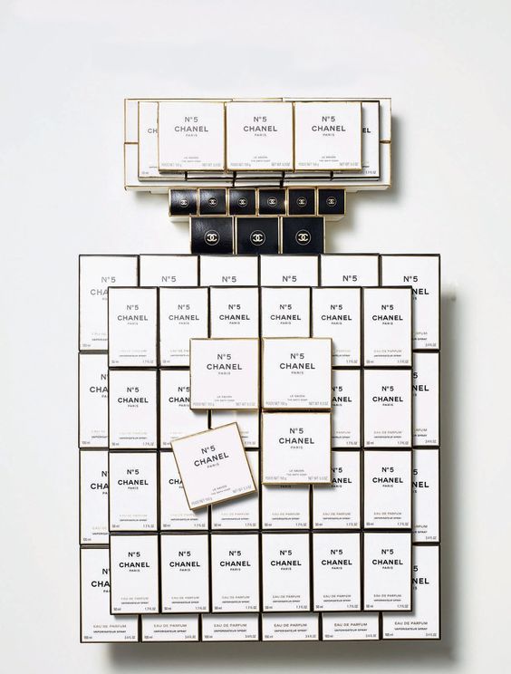
Nothing speaks to classic sophistication like the minimal black and white Chanel packaging. Luxury branding after all is all about simple, subtle, and understated quality.
The spirit and inspiration of Chanel founder Gabrielle Bonheur “Coco” Chanel lives on today in the company’s two “headquarters”—Paris and New York City. Of course, the elegant and timeless designs of the company still originate in Paris; however, the teams responsible for bringing those unique designs into reality work in concert in Paris and New York to guarantee a singular Chanel experience across the globe.
Complete consistency
The consistency in the product and packaging is Chanel’s primary goal. The secret to its package design success is having long-term relationships with a relatively small number of suppliers and having close control on every aspect of product and package production. For instance, global launches are truly global launches of a singularly consistent product and package, coordinated to appear nearly simultaneously around the world.
Michel Dupuis, senior vice president of package development in the Paris headquarters, says the Chanel packaging department operates under a kind of motto: “We have one product for one world.” “We have globalized the process,” Widro, Dupuis’ counterpart in New York, continues. For instance, Widro believes there is no reason to waste effort developing more than one set of tooling for the entire world. This philosophy started in manufacturing, but has bled upstream into packaging, marketing, and advertising.
The essence of the brand
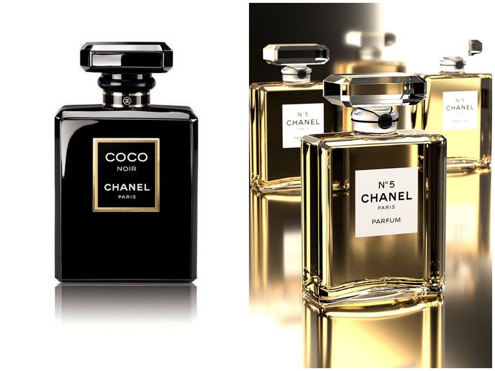
“We try to keep it simple but elegant at the same time,” says Widro. “There are not a lot of colors in the Chanel world.” Aside from making the black as deeply black as possible, the Chanel palette rarely strays far from white, gold, beige, silver, and pink. Coco Chanel was definitely not a fan of heavy decoration, and believed that black and white, straight lines, and rectangular designs represented purity.
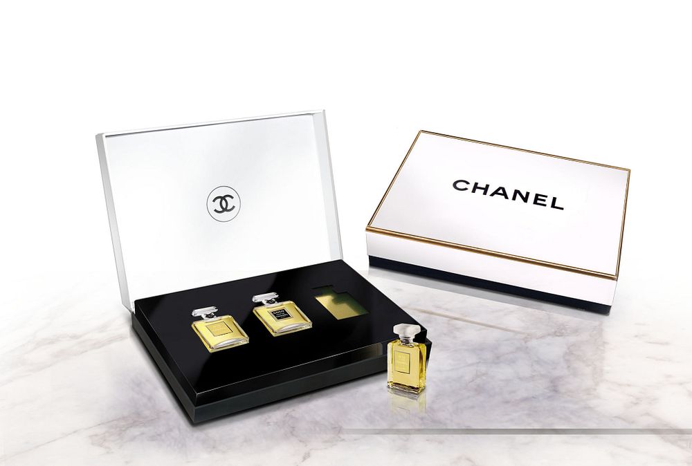
But Dupuis says simplicity is not always as easy as it looks. “It’s very difficult to make something very simple, because small imperfections are more easily noticed.” So tight quality control is essential for a pure glass, pure label, and pure product inside. Consumers may be surprised that the familiar smooth white label for the flagship No. 5 perfume package is not merely white nor merely smooth.
“Merchandising is like theater. The first contact with the brand is the package. You need to have everything together.” – Michel Dupuis
Did you know that… After Coco Chanel’s mother died at age 31, Gabrielle’s father sent his three daughters to the convent of Aubazine (Central France), where the nuns taught her discipline—and sewing.
Chanel’s interlocking ‘C’ logo closely resembles the curved patterns featured in the stained glass windows of the church where she spent her childhood. This is how she found the inspiration for the worldwide famous logo icon.

Sources:
http://www.packagedesignmag.com/content/singularly-coco-the-house-chanel-controls-every-detail-global-launches-classic-and-refined-p
http://www.thedieline.com/blog/2013/10/16/a-historical-glimpse-behind-luxury-branding-packaging.html
Read more Swedbrand blog posts at swedbrand-group.com/blog, or visit our website at swedbrand-group.com.